Design, Print Tips
Vinyl Banner Design Tick list
Vinyl Banner Design Checklist
Vinyl banners and other large format prints are some of our most popular products. We’ve seen them used in a variety of situations, from event announcements and trade show ads, to temporary outdoor signs and demonstration materials. Vinyl banners are durable enough to be reused in moderately harsh outdoor conditions and in direct sunlight for months at a time with minimal to no fading, thanks to UV-resistant inks and high-quality 15 oz. vinyl.
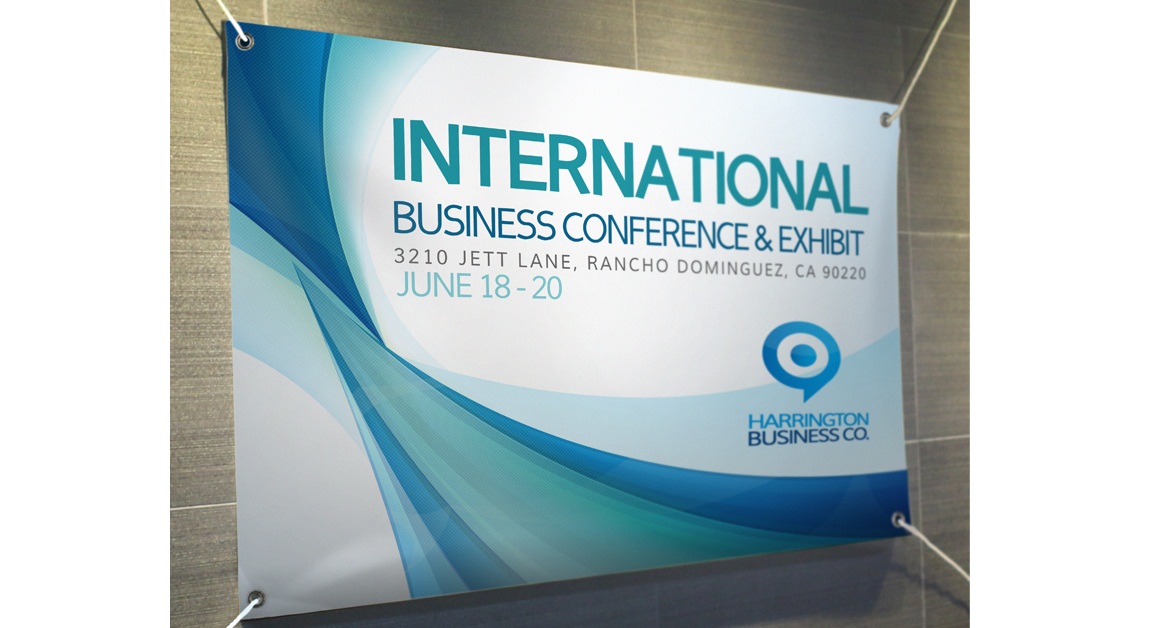
Banners are a bigger investment per piece compared to most other print products, so it’s understandable why you might only want to have a few copies of any particular design. This means making your design count, even before you send it over for printing.
Our vinyl banner design checklist will show you the important points to look over before you have your vinyl banner printed.
8.) Context
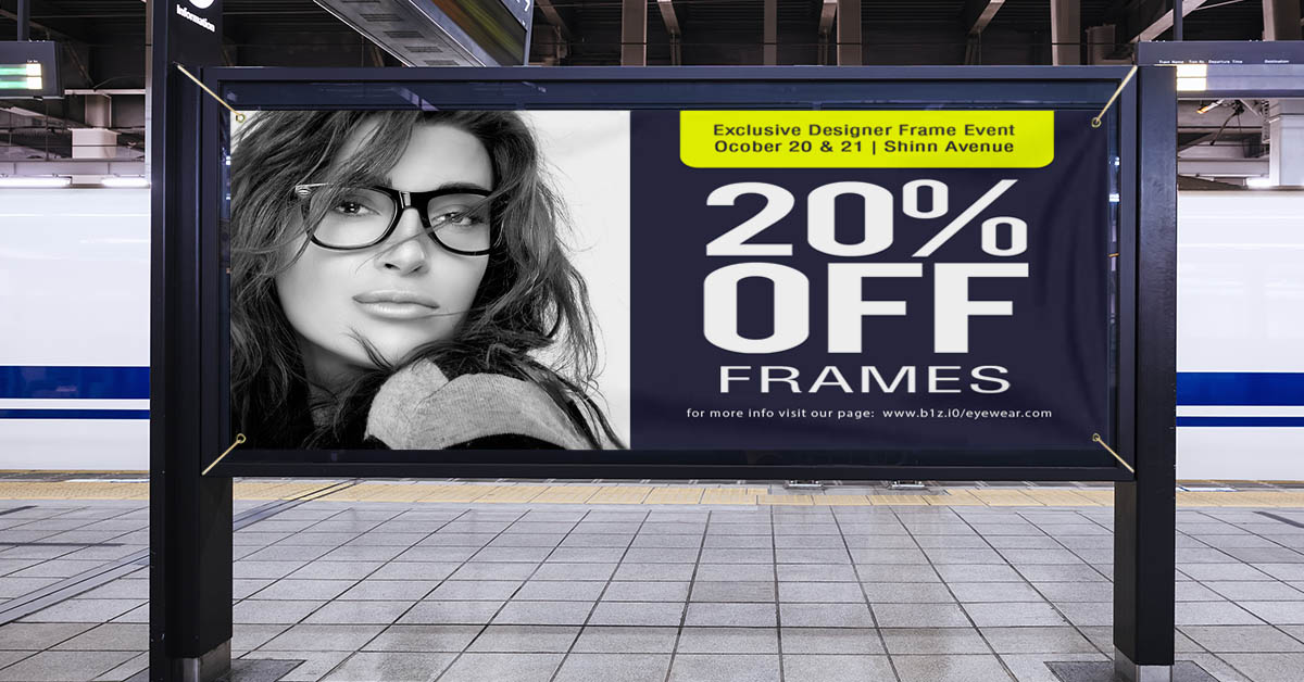
Where will you use your banner? How far away will it be from your target audience? A banner intended for a trade show where you could expect people to come close enough to touch them would most likely need to be designed differently from one hung from the side of a building.
Copying design elements from other banners without understanding what they’re used for can result in a design that simply wouldn’t work for what you need.
7.) Monitor Calibration
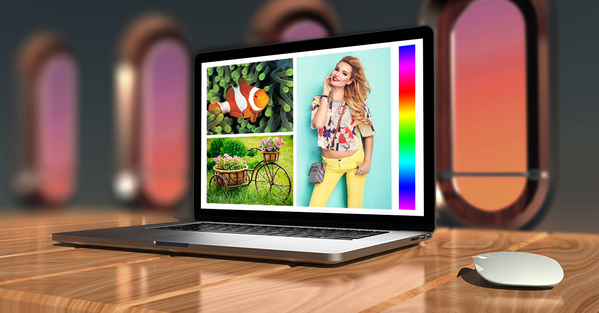
This part is often overlooked, even by graphic designers. Your monitor will display colors in a different way from print products.
For example, a picture might look red on an uncalibrated monitor but come out pink or orange when printed. Consult your monitor’s user guide or online resources to see how to calibrate your monitor.
6.) CMYK color settings
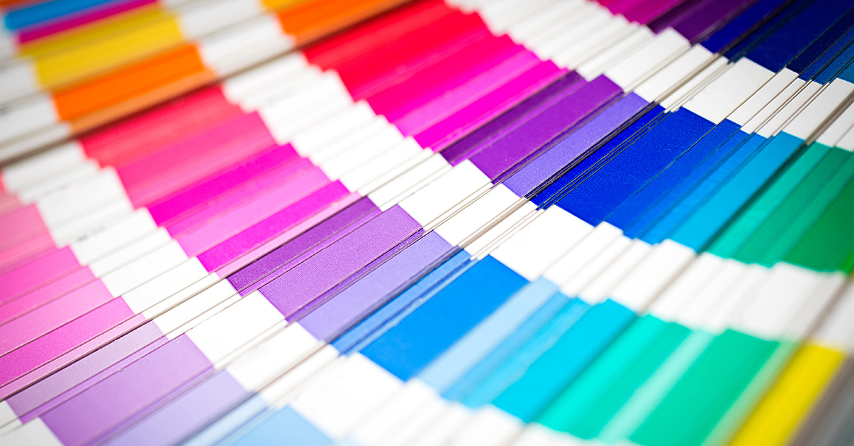
Your monitor will typically display images in RGB (Red, Green, Blue) while most printers use CMYK (Cyan, Magenta, Yellow, and Key color Black) to reproduce those same colors. You’ll want to create a file calibrated for CMYK for maximum color fidelity.
Fortunately, almost all specialized design, illustration and image editing software allows you to do this. Just don’t use a word processor or spreadsheet program to design your banners. This ensures better color fidelity when printing.
5.) Size
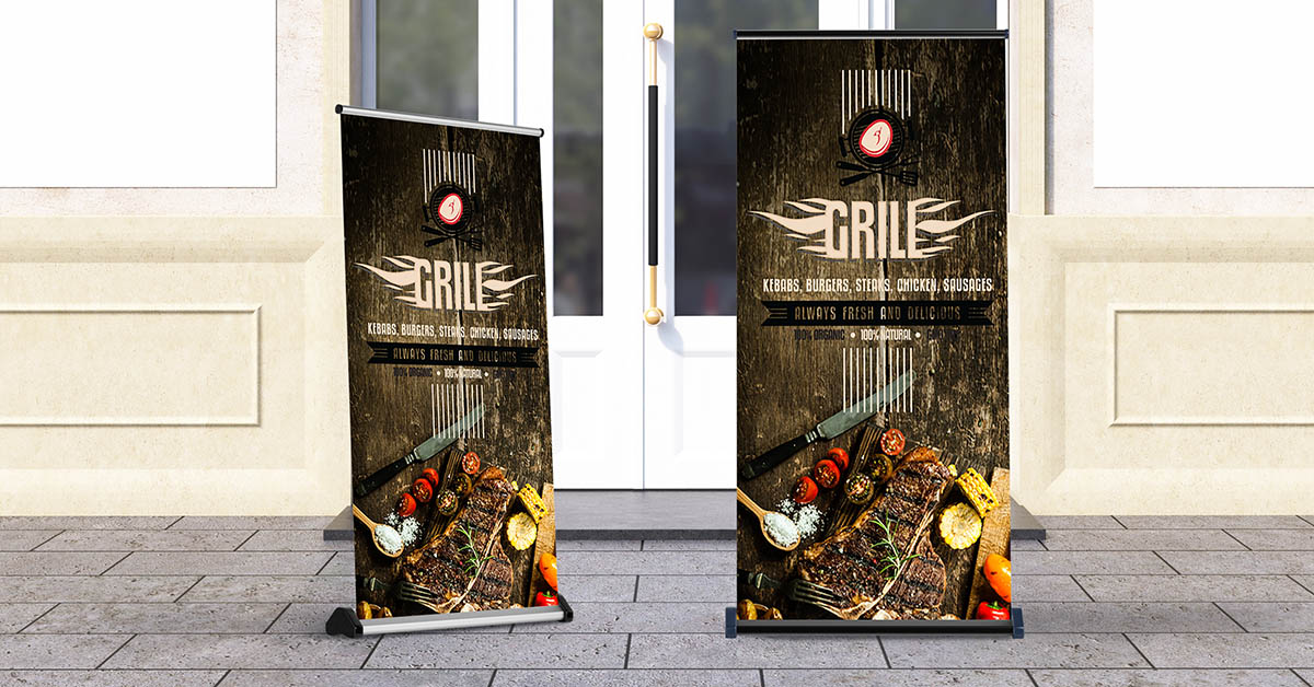
This should reflect how you intend to use your banner. Smaller banners work well when you expect your audience to be closer, such as in more personal events and social gatherings.
Larger banners work better if your audience will be at a significant distance (30-100 yards). When in doubt, it’s safer to err with larger banners, as they can still be seen well up close, where smaller ones might be useless when your audience is too far away.
4.) Color contrast
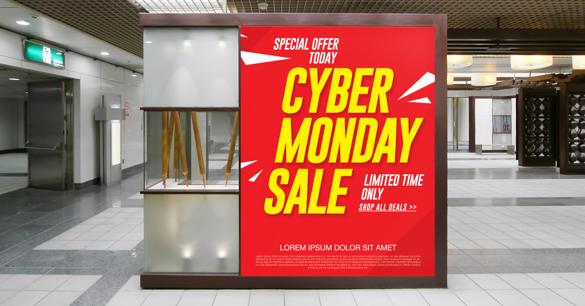
If there’s something on your banner that you particularly want to be seen – such as a tagline or a logo – the colors used shouldn’t blend into the background. Keep this in mind as you create your vinyl banner design. You’d want the colors on those elements to contrast with the background as much as is practical.
3.) Space
Less is often more when it comes to banner designs. Cluttered spaces make important images and text more difficult to figure out.
2.) Fonts

Use fonts that are easy to read. You want to avoid using novelty fonts to avoid confusing readers. Try to avoid using more than two different fonts, and try to stick with just one if practical. Again, make sure your text color sufficiently contrasts with the background.
Each font also has a “personality” attached to it, so try to use one that matches your message.
1.) Images

UPrinting’s digital printers are capable of producing photo-quality prints, but the quality of those prints also depends on the quality of the images you send.
You’ll want your image resolution to be appropriate for your banner size in order to gain a more crisp contrast and avoid obnoxious pixelation.
Rules of thumb
If you’re not including any photos in your vinyl banner design, or only need to print a simple design, vectors are highly recommended to allow the best possible definition at every size.
If you need the design to include photos, or other rasterized elements, a final printing size with a resolution of 150 ppi or higher is always recommended for banners. If you wish to include a photograph (any rasterized image) in your banner design, make sure it is created at the highest resolution possible to reduce the amount of enlarging required to fit your banner.
Banners intended to be viewed from only a few feet away will look better with higher resolution artwork. Enlarging any image will reduce the resolution and possibly cause pixelation or blurriness, which will be more noticeable when viewed close up.
Banners intended to be viewed from further away, such as a few yards or more, can get away with slightly lower resolution, as any image imperfections will be harder to see. Enlarging an image to a resolution below 72 ppi will generally produce poor results, regardless of banner size.
Here are a few guidelines:
- 72 ppi*(pixels per square inch) – Poor to Fair
- 100 ppi – Fair to Good
- 150 ppi – Good to Very Good (Recommended minimum for prints meant to be viewed a few feet away)
- 200 ppi – Excellent
- 150 ppi – Poor to Fair
- 200 ppi – Fair to Good
- 300 ppi – Good to Very Good (Recommended minimum)
- 400 ppi – Excellent
Please note that this makes more sense if you intend to print a photo-quality image on your banner. With some very simple banner designs that use only a few colors, and very high contrast backgrounds, you can get away with much lower resolution values, but it’s highly recommended these designs use vectors for better results at any distance.
Tick off the items on this banner design checklist in before you send your banner designs for printing will save time, and help you create more effective banners.
Love/Hate this article? Questions? Insights? Just head over to the comment section below. We’d love to hear from you!
