Design
Basics of Brochure Design
Fundamentals of Brochure Design

Before diving into making your brochure, you should know the purpose of your brochure. Use this as the building block of the design concept and theme of your brochure design. Keep in mind that your brochure design is important because this is one of the deciding factors of potential customers if they will take or disregard the brochure. Once you have a design in mind, consider also the standard brochure sizes if it would fit.

Logo – Your business’ name and soul. Put time and effort with your logo because it will carry your brand. Place your logo in a noticeable position and on the front and back cover of your brochure.
Features/Benefits – This is located inside of the brochure. This is the part of your brochure where you tell your audience about your products/services.
Photos – Found inside the brochure; provides visual support of the features and benefits. Using pixelated or blurry images is a big no-no.
Call to Action – Include discount schemes like coupons to give a reason for your potential customers to take action. Highlight these calls-to-action for it to be seen easily.
Contact information – Usually placed at the back of the brochure containing all the contact information of your business. (I.e. email address, address, telephone numbers and mailing label)
TYPEFACES
It’s challenging to choose the right typeface for your brochures – it’s best to use no more than two. To help you choose, listed are two sets of typeface divided into formal and informal styles.
- Century Schoolbook
- Century Expanded
- Georgia
- Palatino
- Geo Sans Light
Informal typefaces are most commonly found in restaurant and theme park brochures. These fonts are fun to use because they give a more casual impression. The idea behind these is to give off the feeling of enjoyment. Included in this category are:
- Sailor Larry
- Coney Island
- Amperzand
- CAC Pinafore
- Bolton
COLOR MATCHES
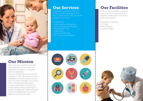
White – This is a neutral background color signifying cleanliness, purity or softness. This color is most commonly used in hospital brochures.
Green – A warm color that symbolizes nature. The easiest color on the eye, it actually has both a warming and cooling effect. This is found in nature-related product/service brochures.
Black – The ultimate dark color that represents authority and power. Black is popular in the fashion industry because it is elegant and stylish at the same time. You will see a lot of fashion brochures using black as their main color.
Red – A color that signifies power. The most emotionally stimulating color used to grab attention. It is often used in restaurant and other food-related brochures because it is also an appetite stimulant.
COLOR COMBINATIONS

Analogous – These are created when three adjacent hues are used together which creates a comfortable look.
Triads – A triadic color scheme uses three colors that are evenly spaced around the color wheel, resulting in vibrant combinations.
Complementary – Colors that are opposite to each other on the color wheel. The contrast can create a vibrant look, but manage them carefully so the effect is not jarring. Remember not to use complementary colors on your texts to avoid overwhelming your customers.
THE RIGHT PAPER
Card stock is thicker than paper stock and more durable compared to paper stock, and so has a more high-quality feel. For businesses who market their products and/or services as premium items, we recommend using card stock.
After choosing a paper type, select your paper finish for the added effect. Matte has a subtle appeal that suggests exclusivity and a first-class feel. Gloss gives a shiny finish that helps your designs pop off the page.
5 TYPES OF BROCHURE
Leave-Behinds – “After Sales Pitch”


Include complete descriptions and benefits of your product and/or service in these brochures, and then give them out – after meeting with potential customers to make a lasting – and hopefully profitable – impression. Use these brochures when you want to get the word out there about your business.
Point-of-Sale – “Over the Counter”


You encounter these brochures when waiting in line at the bank. One look should be enough for your customers to know what your brochures are all about. The key to point-of-sale brochure is to have catchy headlines and images to attract attention. Its purpose is to spark interest so that your potential customers would ask about your products/services. These types of brochures can be seen over the counter at groceries with information on products/services typically related to food and nutrition.
Respond to Inquiries – “Answer the Query”

Outside

Make these brochures for potential buyers who inquire about your business. This is a great opportunity for you to seal the deal because the customer is already interested in your product/service. Along with more information, put a call-to-action like a registration form to help them in the next steps of the buying process. Emphasize on content over design.
Direct Mail – “Post Box”

Outside

This type of brochure is mailed out to local residences without prior knowledge if they are your target audience. State a very attractive offer to your recipients because it’s very easy to be categorized as junk mail and thrown away. Think of it as a sales pitch on paper, content should be capture and design should attract.
Sales Support Tool – “Sales Kit”

Outside

Sales support tool are like leave-behinds but have larger photos, pages and headlines. These are used as sales aids to help your team deliver their pitch better because of their size. These will keep your audience interested and help them retain the information after the pitch is delivered.
After you’re done with your brochure design, make sure it is print ready with our Free PDF Proofing service. For more information, give us a call at 1-888-888-4211 or chat with friendly customer support representatives. Our lines are open 24-hours from Monday to Friday and 8am to 9pm during weekends and holidays.

