Design
7 Efficient Typography Tricks to Spice up Your Print Designs
7 Effective Typography Tips to Boost Your Print Designs
The world of fonts and typography is so much more complex than it seems at first. When you get past the Comic Sans hate and other usual tropes of the subject, you might find that there is so much more to it than choosing the right font. These seven effective typography tips should help casual designers not only use typography more effectively, but also perhaps, give a deeper appreciation for design as a whole.
1.) Learn kerning.
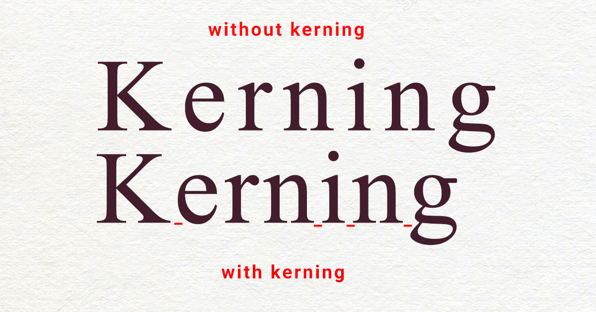
Kerning generally refers to the spacing between characters and other typographic elements within a design. Good kerning will help your message come across much clearer and add to the overall feel of your text. If you’re lucky, bad kerning will just make your message a bit weird to look at. If you’re unlucky, bad kerning can totally subvert what you have to say.
Have a professional graphic designer look over your work if possible, and always test your designs (see #7) before sending them off to be printed.
2.) Understand what fonts “say.”
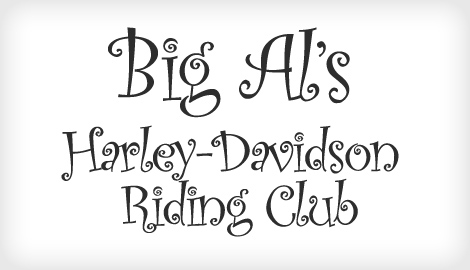
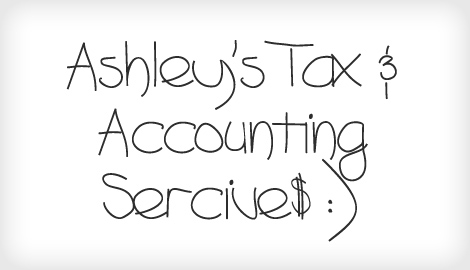
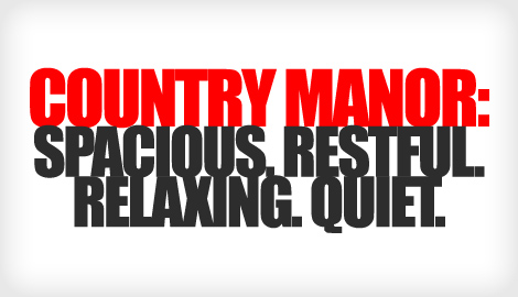
Every font communicates a certain mood, which can be used to enhance a message. In the examples below, the fonts are made intentionally inappropriate. The fact that many of them are actually amusing serves to underline that all fonts do in fact convey a mood.
Check out these dissonant font-message combinations from bonfx.com:
3.) Choose sizes carefully.

Not only must you be aware of the proportions of your text, you should understand their intended viewing conditions. Font sizes that are fine on flyers or business cards might be totally out of place on a vinyl banner or poster. Another thing to to consider is that different fonts may actually be bigger or smaller compared to each other when they are the same size on your graphic design tool or word processor. Be sure to judge them based on how they work on your design, not based on an arbitrary size number.
4.) Be aware of alignment.
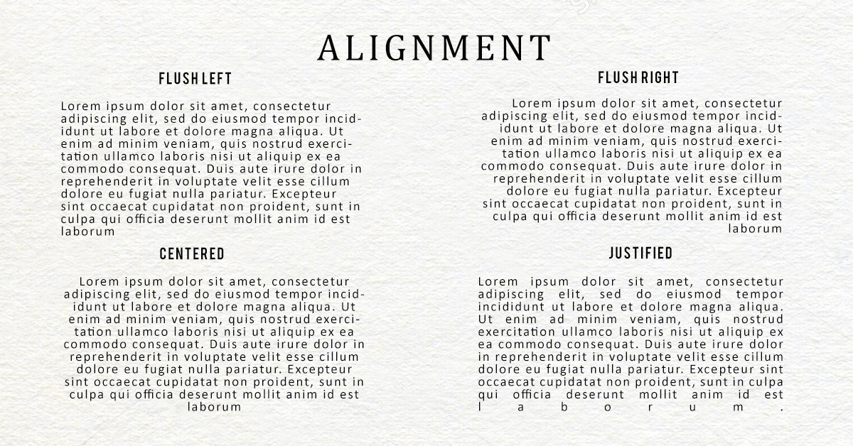
Text alignment has a much bigger influence on our ability to read than you might expect. In English and other languages with similar writing systems, we are used to reading from left to right. Centered or right-aligned text is harder to read for long periods because we are used to seeing the start of words aligned left. Because of this, it’s important to reserve centering and other non-standard alignments for short bits of text such as as headlines, and other special cases.
5.) Choose only complementary fonts.
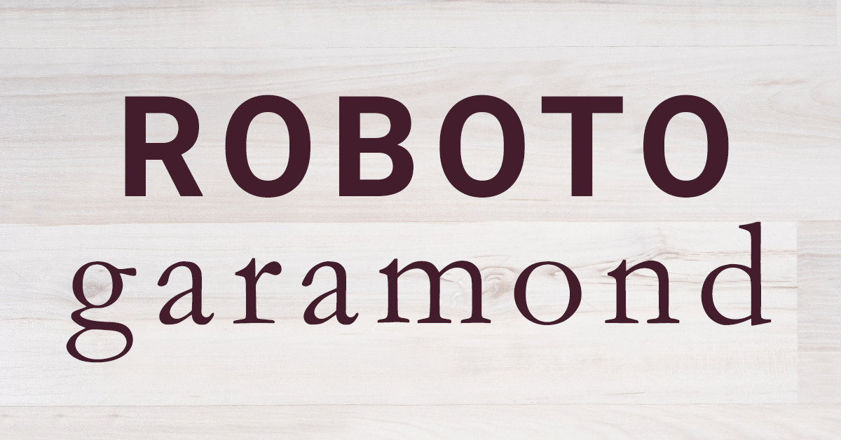
Some fonts simply don’t go all that well together. There are no rules on how to mix and match fonts. But generally speaking, serif fonts match well with sans serif fonts, and fancier-looking fonts should have something more bland to go with them. While those are good starting points, don’t be afraid to look at different combinations. If it looks good and it works, then it probably is good. This article on serif vs sans serif from fonts.com is a good starting point before you plunge deep into the rabbit hole that is font-matching.
6.) Limit the number of fonts, colors, and styles.
WriteMarketDesign
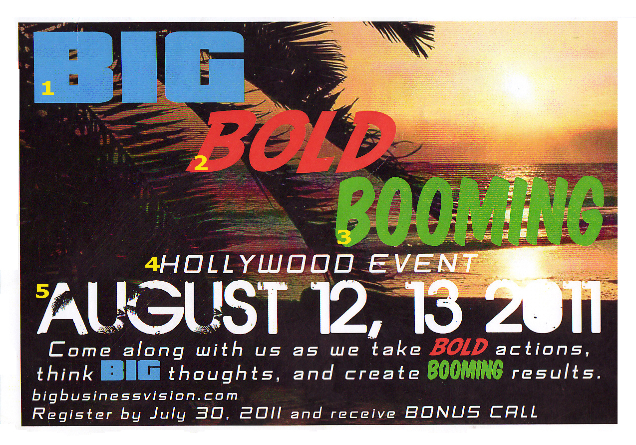
Try to use as few elements as possible with your fonts. Fonts are a recurring design element. Using too many different ones can easily give any design a cluttered messy look. This doesn’t mean you should only stick to one font, but generally speaking, over three different styles together can be really pushing it.
7.) Test your fonts.
The proof as they say, is in the pudding. When you work on a design, losing the big picture can often be way too easy. Even if you think the output looks good, you will want to test your final version. You can do this by viewing it from different distances and multiple angles. One popular test is to flip the design backwards and turn the whole design upside down to see if it could still be read. Doing this simple test can often expose flaws in kerning and proportions that designers could easily miss otherwise. A headline that could be read that way without too much difficulty is sure to legible.
Did you find these tips helpful? What other simple yet effective typography tips would you share? Comment below.
