Print Tips
10 Print Advertisements That Be successful and What Makes Them Particular
10 Print Ads That Succeed and What Makes Them Special
Print advertisements continue to hold a special place even in the digital age.
The medium of print ads continues to be tested and brought to its limits, often surprising the most jaded of us. While most are easy to look over, thousands of stellar print advertisements are produced each year.
The reasons why they actually work however, can easily escape us. In the following list, we explain exactly why the ad works, in context. While these aren’t necessarily the best print ads, they work very well in the context of print and other short form advertisements. Each one of these ads was specifically selected because they all contain ideas any marketer can use.
10.) Sanccob
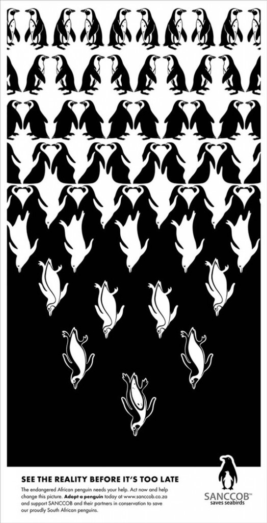
This ad for SANCCOB, an South African group dedicated to native penguin conservation commissioned Bittersuite for this ad. Appropriately titled Tipping Point, this ad features a thought-provoking use of just the two colors associated with penguins to highlight their plight.
9.) Duracell

This was part of a series of Duracell ads that exaggerated battery life. The sinister undertones of this Duracell ad also provide a dose of humor and the composition is intended to maximize your attention on the ad. Humor can be a simple way to help readers connect with your ad, when they otherwise wouldn’t.
8.) McDonald’s
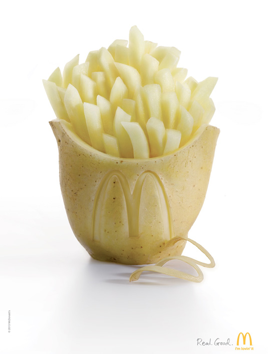
In a world that increasingly rejects the artificial, Shanghai’s TBWA successfully ties in McDonald’s “Real. Good.” tagline into a visual appeal.
7.) The Guardian (US Edition)
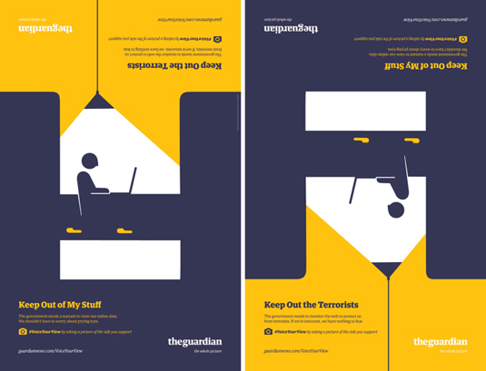
The UK-based media outlet The Guardian recently started a U.S. edition, appealing to an increasingly polarized audience with an ad that shows both sides of an argument.
6.) Sharpie
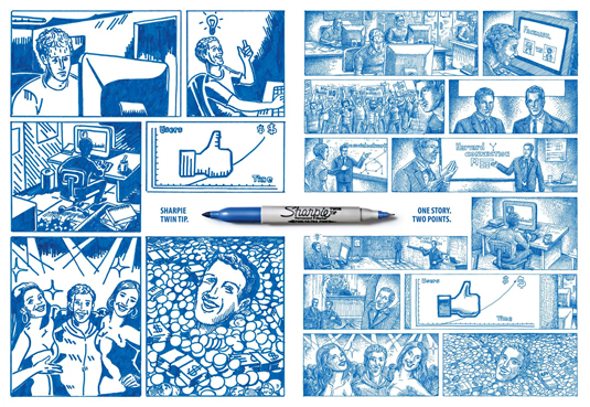
When the medium itself allows you to demonstrate your product, go for it! This ad shows some of the possibilities of having one Sharpie to rule them all.
5.) FedEx Brazil

This ad showcases FedEx’s then new Brazil office. It captures Brazil’s local flavor while being understandable in any language. Provided you have an OK grasp of geography, that is.
4.) Pantone
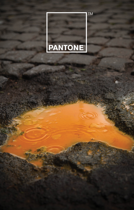
Many modern print ads, including the ones on this list, apply (perhaps abuse) High Dynamic Resolution or HDR so colors pop out and make images appear hyper-real. It’s often seen as necessary to help a print ad “jump” out at you, as a magazine is typically full of high quality images in both the articles and the other ads.
Giuliano Lo Re and Matteo Gallinelli went the opposite direction in this ad for Pantone, choosing to purposefully choose a limited color range to good effect.
3.) Scribe
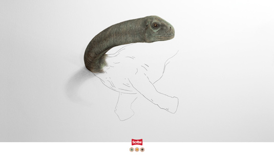
Similar to the Sharpies ad on this list, Colombia’s Melborp agency created this to demonstrate just what could be done with Scribe pencils.
2.) Finishizer
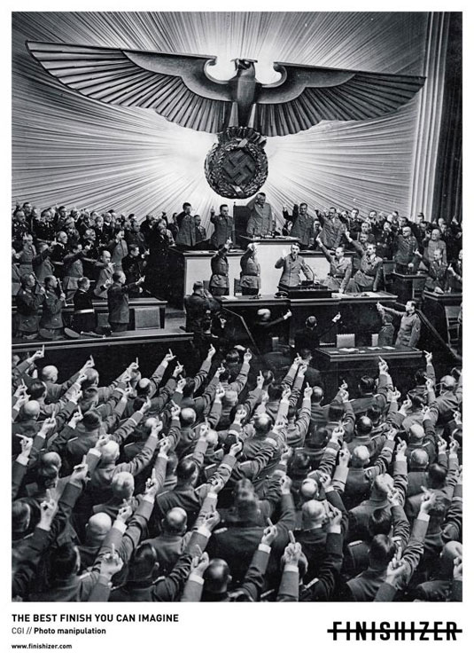
This Oglivy and Mather ad for a photoshop manipulation contest was controversial for obvious reasons. But it’s rare that something as taken-for-granted as a photo manipulation contest can make you really think. In this case, Finishizer decided to deliberately use controversy as a tool to hold your attention. It’s always a gamble to use this tactic, but when done well, it can pay off.
1.) Adidas
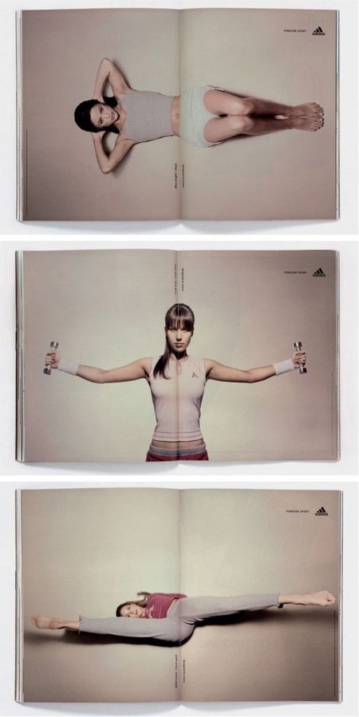
This series of double-spread print ads challenges ideas about print being a static medium. The interactivity of this ad also helps reinforce any connections that are made — you’re far more likely to remember it because you’ll probably try to move the pages around, spending more time with it.
BONUS: Volkswagen
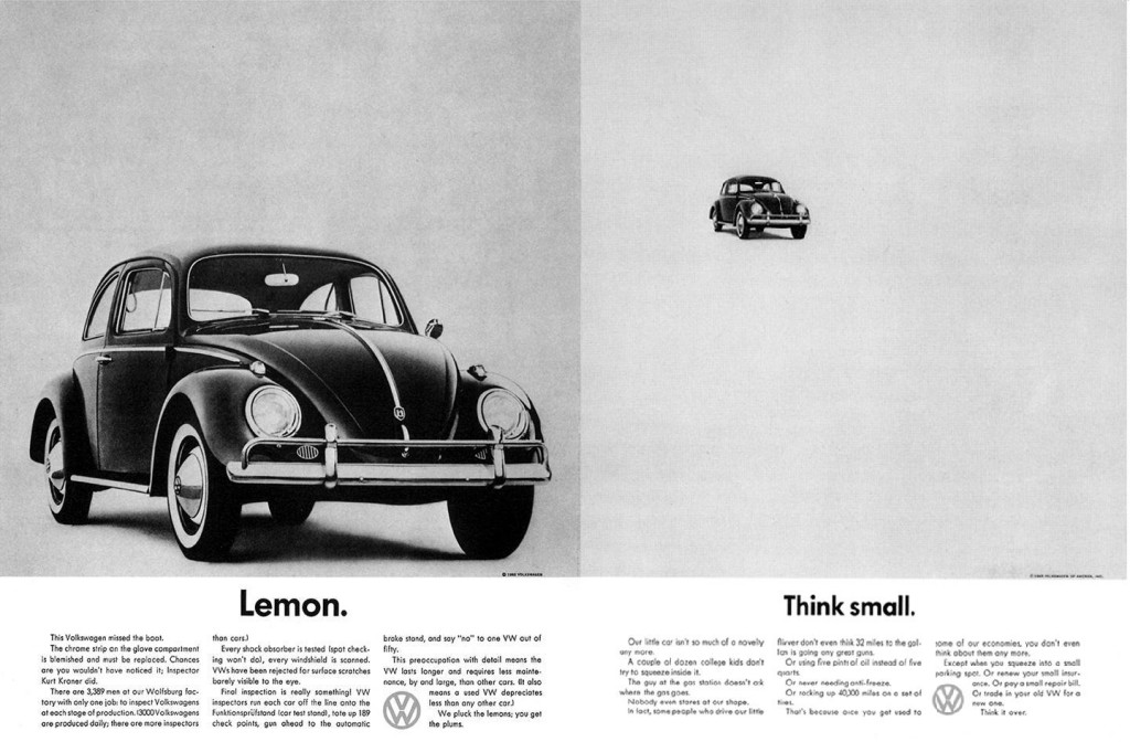
Where would print ads today be without the granddaddy of modern magazine ads? Before this ad series, walls of text were the norm and even this ad’s copy is long by today’s standards. But back then, it was almost shockingly brief. Nothing was the same after Volkswagen released the Think Small series of print ads in 1959, and the image, brand, and tagline template has become the template for today’s print advertisements.
The iconic art direction was executed by Helmut Krone and the copy written by Julian Koenig, both from the Doyle Dane Bernback agency. Nearly every print ad today has a bit of Volkswagen’s DNA in them, especially with regards to the minimalist style and extremely focused message.
What makes a winning print ad?
All of the print ads above deliver all or most of the following:
- Humor
- Delight
- A focused message
- Dynamic form and movement
- Interesting talking points; controversy
If you have most of these down on your next print advertisement, you’re probably on the right track.
Thoughts? Comment below!

